The first Song of the Lioness book came out in 1983, exactly thirty years ago. (For a review/refresher, head over here!). So obviously the covers have been updated about a million times-- sometimes for the better, other times for the worse. Let's take a look at all (well, all the ones on Goodreads, because I am just not that thorough of a person) the Alanna cover variations over the years and choose which ones are the best, shall we? By the way, I will always love the covers I grew up with the most, because I am biased.
Don't forget to vote in the poll at the bottom!
Alanna: The First Adventure
1.
 |
| Original cover, pub. date 1983 |
My biased opinion: I'm loving the Black City in the background, but Alanna isn't ginger enough, her eyes aren't purple, and I really, really don't like the way they've drawn Jonathan back there. He has a mullet. PRINCES DO NOT HAVE MULLETS. Also, Moonlight is the wrong color. She's not a white horse. She is distinctly described as sandy colored with a white mane and tail. FOOLS.
2.
 |
| Oxford University Press, 1984 |
My biased opinion: Alanna is way more bad ass than this wishy-washy cover indicates. I love the shining purple jewel in Lightning's hilt, and the gnarled trees, but this just doesn't convey the kick-butt lady warrior feel at all. This could be any generic fantasy cover. Nay, I say.
3.
 |
| Beaver, 1986 |
My biased opinion: Okay, the horses are the total wrong colors, but DUDE, those evil Ysandir swirling out of the Black City like that? And the Great Southern Desert and the oasis and ginger Alanna? I approve. This cover conveys the action and adventure in this book quite well, and it's very charmingly eighties. It reminds me of The Blue Sword cover.
More covers after the jump!
4.
 |
| German cover, Arena, 1986 |
My biased opinion: I approve of the purple, and the ginger Alanna, but wish this cover were more unique. I like Alanna's little red and gold doublet shirt thingy. Very stylish.
5.
 |
| Knopf, 1989 |
My biased opinion: Does that really say "she burned to become a knight of the realm"? Why did you make little prepubescent Alanna sound all sexually aroused, Knopf? I would like this cover were it not for the sexified Alanna, showing off her preteen guns, and the fact that JONATHAN DOES NOT HAVE BLACK HAIR. But I love Jon's awesome cape and A's bad ass boots.
6.
 |
| Red Fox, 1992 |
My biased opinion: NO.
7.
 |
| Scholastic Point, 1998 |
My biased opinion: Huh. I kind of like it, though I prefer the covers that actually depict Alanna in all her glory. The details on the sword are gorgeous, and I like the colors (would have been better if it were amethyst purple). This looks to me like a cover designed to entice more adults into the series.
8.
 |
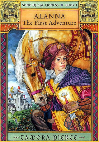
| Peter Smith, 1999/Random House 2003 |
My biased opinion: THE GREATEST COVER IN THE HISTORY OF EVER. Obviously, this is the cover I grew up with, the cover that introduced me to the big wide world of Tamora Pierce, and I shall forever love it. Alanna is appropriately small, ginger, purple eyed, aglow with her Gift, and rocking the coolest yellow tunic in Tortall. And Moonlight's coloring is correct, and the designs on the side are super pretty. Not so action-packed, but SHUSH. It's perfect.
9.
 |
| Atheneum, 2002 |
My biased opinion: This book is so different from how I pictured Alanna and Tortall that I'm having a hard time with it. But all the coloring is correct, and there are nice details, and I love the fierce lioness heads up there. Also, I'm digging Alanna's jaunty little feather. Even though her bangs are tragic.
10.
 |
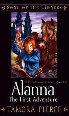
| Turtleback/Simon Pulse, 2005 |
My biased opinion: Even though Alanna looks like she's about to eat my soul, she also looks like she could whip my ass in fencing, so that works for me. Her hair is way too long (seriously, she could never pass for a guy). Also blah blah Moonlight's coloring broken record blah, but why fight a losing battle. That Black City is TREMENDOUS.
11.
 |
| Audiolino, 2006 |
My biased opinion: Let us move on and never speak of this again. I understand she is literally a page boy, but that does not excuse that wretched haircut.
12.
 |
| Viamagna, 2007, Spanish |
My biased opinion: Again, I don't approve of sexifying eleven- to fourteen-year-olds, especially ones trying to pass as male, but no sane person would mess with a bad ass like the Alanna on this cover. I also love that the translated cover is simply Alanna: The Warrior.
13.
 |
| Omnibus, 2007 |
My biased opinion: Clearly meant to tie in with the Trickster book covers that I first owned, which nice because I think those covers are gorgeous. I love the look of this as well, even though, again, it doesn't convey the blood and sweat and sword-ing going on inside. She's a little too glossy, and her eyebrow's a little too shapely. But she's got the purple eyes and fiery hair, and, aesthetically, this cover is captivating. This would draw in a Pierce newbie for sure.
14.
 |
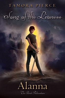
| Atheneum, 2010 |
My biased opinion: I. Love. This. She looks small, but also strong and powerful. The sword's at rest, but you can tell she knows how to use it. She looks boyish, but you can tell she's secretly a girl. Her Gift is the wrong color, but hey. I'll forgive it for that awesome smoky castle in the background and the excellent font treatment.
15.
 |
| Ufuk, Indonesian, 2012 |
My biased opinion: Wait, the Indonesian cover is totally awesome! Check out that sweet cloak-y thing Alanna's wearing, and the distant hazy castle. This fails the ginger-Alanna check, but it definitely gets points for bad-assery.
So now I turn it over to you: Which cover is your favorite? Vote in the poll and/or sound off in the comments! I'd love to know which cover introduced you to Alanna.


In cover 1's defense, "sand" isn't a universal color. I'd even argue sand is more likely to be white than yellow. If she wanted the horse to be palomino, she should have just said so :P
ReplyDeleteFair enough, but sand in reference to color (particularly hair and animal coat color) is almost always that yellowish tawny, even though in real life sand can be many different shades. And again, objecting to the horse's coat being the wrong color is just me being a nitpicker! It doesn't actually make the cover worse. There's something charmingly retro about Cover 1. It's the original, after all.
DeleteI'm totally biased and picked cover number 10 because that's the cover I grew up with. All of my books are in that design so that's what I automatically associate the series with.
ReplyDeleteI picked 10, just because it's the one from my library. :) Instant recognition. (We only have the first book, though, which is why I haven't read the series.)
ReplyDeleteI'm with Rachel - I read it with cover #10 as well, and that's the design of all the books that I will have in my hands soon. But I do like the last one as well, because it looks like it's illustrated very well!
ReplyDeleteI LOVE the Atheneum cover (#14.) That said, over the course of this event, I can tell y'all are gonna break me until I read these books. :D
ReplyDeleteMolli | Once Upon a Prologue
"THE GREATEST COVER IN THE HISTORY OF EVER"
ReplyDeleteYou speak the truth.
I like #1 and #7 - but i really love the "new" german ones. The color scheme is great and they are not too cluttered...
ReplyDeletehttp://imagesup.net/?di=813720134881