
 |
| Hosted by The Broke and the Bookish |
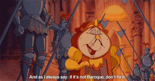
There's nothing worse than when a publisher redesigns a cover that's already beautiful. It causes mass chaos and despair in the bookish world. It makes us cry into our pretty hardbacks, lamenting the good old days before it all went so wrong. We are very dramatic in the bookish world, but then again, we were raised to listen to Cogsworth:
Special credit goes to Madam Cover Snark herself, Christina from A Reader of Fictions, for perusing her own bookshelves in the aim of helping me put this list together. Bless you and your hideous books. :)
1. Crewel by Gennifer Albin


The original is magical and ethereal and original. The second is as generic as they come and doesn't entice me to read this book
2. The Diviners by Libba Bray

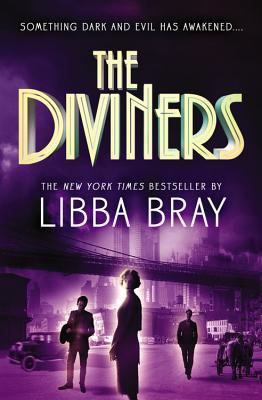
WHO THOUGHT THIS WAS A GOOD IDEA??? The cover for the sequel, Lair of Dreams, is even WORSE.
3. Delirium by Lauren Oliver


That first cover is SO CRAZY BEAUTIFUL. It's haunting and the colors are lovely, and omg pretty font. The other one is... a girl's face. And a really ugly plant-like thing.
4. Across the Universe by Beth Revis


Even though they're doing that upside-down Spiderman kiss thing, I love the original and it's gorgeous star-strewn background. The new one... doesn't offend me, or anything, but it's a bit junky and far less romantic. Plus I suspect it was redesigned to "appeal to boys".
5. Keeping the Castle by Patricia Kindl


I haven't read this book, but I want to, even though all I really know about it is that the first cover is beeyootiful, and the second is rather disturbing. There's something wrong with that girl. MAKE HER STOP LOOKING AT ME.
6. Unspoken by Sarah Rees Brennan

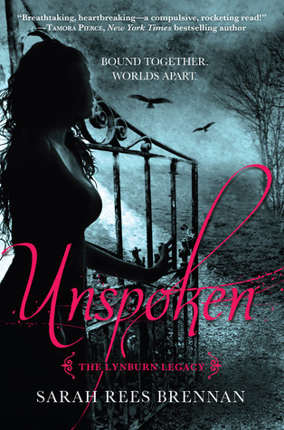
UGH. This one hurts my feelings. I ADORE that original cover. Silhouettes just speak to me, for some reason. And the colors and the swirly bits... sigh. Eyegasm. New cover? Whaaaaatever. It's the generic paranormal version of the gorgeousness on the left. Plus boobs.
7. Leviathan by Scott Westerfeld


Why do publishers think that all books need peoples on them? We don't need peoples! I love the mechanical, abstract, symmetrical pattern on the original. The best thing about the redesign is that it kept some of those aspects and the font, though that face, man. That face. What is with his mutant brow? And that one shiny eye? IT'S HORRIFYING.
8. Ella Enchanted by Gail Carson Levine


Okay, so I don't think the original is TEH G8EST COVER EVA or anything, but it's classic and the one I grew up with. That new one... I don't know if you've ever seen it in person, but it is violently shiny. Like, it reaches though the air and pokes your eyeballs with its shiny cover fingers. And what are you smirking about, young lady? Get back to your book. Children these days.
9. Sisters Red by Jackson Pearce
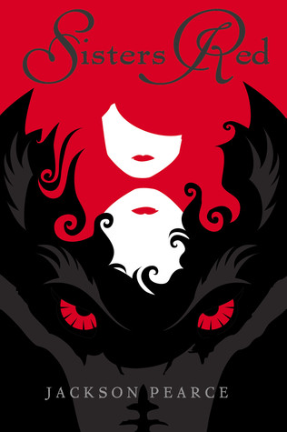

NOOOOOO. That was basically my reaction when I found out from Christina that this one got redesigned. BECAUSE WHY. To fit in with the rest of the loosely related books Pearce has written? Who cares? LOOK at the bright and graphic gorgeousness of the original. IT'S SPLENDID.
10. Venom by Fiona Paul
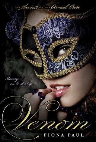

Check that girl out. She's saucy. She knows things. She's totally about to go waltzing through Renaissance Venice to catch a murderer. Now look at the other girl. She is... holding the hand of an ugly dude. In front of a poorly lit bridge. Thrusting her butt out. Hand-on-the-hips is a modelling 101 pose, girl!
11. Nightshade by Andrea Cremer
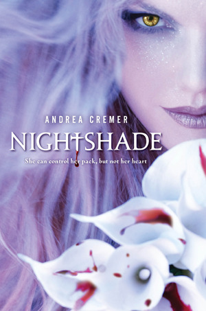

The original isn't fabulous, but it's got lovely colors and looks like something I wouldn't be embarrassed to read in public. The redesign? BWAHAHAHAHAHAHA WOLF FACE AHAHAHAHAHAHAHA


I am in so much agreement abut all of these, but especially The Diviners. I AM FOREVER BITTER ABOUT THIS REDESIGN.
ReplyDeleteI actually had no idea some of these covers got redesigned and they're making me SO SAD. The only one where I actually like the new one better is DELIRIUM; the rest are WHY WHY WHY?? CREWEL and ACROSS THE UNIVERSE had such stunning original covers, and the others were at least unique. Ugh. I just hope the authors like the newer versions better than I/we do. Otherwise, that must suck.
ReplyDeleteYes to all of these. Especially VENOM. Because I FLIPPED THE FUCK OUT when I saw that one.
ReplyDeleteAnd ugh, THE DIVINERS! That cover was just so perfect the first time around and they ruined it.
Plus, SISTERS RED went from being awesome and cool to BLAH! But I do love the new cover scheme for that series for the final book, COLD SPELL.
I've got a few on my list in common with your own. I agree with all your opinions about these redesigns but The Diviners and Unspoken just kill me. I am in love with the original covers, it would have been nice to how the styles were adapted to future books in the series.
ReplyDeleteIsa @ Chasing Quills
I think both of covers of Crewel are ugly. The first looks like it's been vommed on and the second it's just boring. I hated the Delirium redesign. I do think it needed some work but I totally prefer the first to the second.
ReplyDeleteAly @ My Heart Hearts Books
My TTT
Some of these cover redesigns are really ugly! Have you seen the newest cover of Ella Enchanted? I like it a lot more than both of the ones above! :)
ReplyDeleteI TOTALLY AGREE WITH THE DIVINERS. It really kills me to see it be redesigned. Like why? How is the redesigned cover so much better?
ReplyDeleteThe new cover for Unspoken is okay, but gaaahhhh, silhouettes! I love silhouettes! (Also, I'm glad I'm not the only one who thought boobs. ;D)
I love the stars in Across the Universe. The new cover makes me think the characters are just trapped in an ice cave.
Unspoken is on my list, too! I was heartbroken when I saw that they'd redesigned it. Also, yes to the Secrets of the Eternal Rose series. Belladonna's original cover - which never even got released - was GORGEOUS and the redesign is decidedly not.
ReplyDeleteMy TTT post :)
Yes, I did redesigns I didn't like, too! And I TOTALLY FORGOT about THE DIVINERS. That first cover was so dang pretty and artistic and just ugh and then this new thing comes in and it's just NO. I'm still so bummed they changed ACROSS THE UNIVERSE's cover (drool worthy) and DELIRIUM's (imagine what they could've done with PANDEMONIUM and REQUIEM). I agree with all of these!
ReplyDeleteI love the Unspoken original cover. I do wish that they wouldn't redesign covers that are already perfect for the book!
ReplyDeleteI agree with everything! Even for the ones I haven't read yet! Why does this happen?! I'm pretty sure I almost cried in frustration when the covers were changed for Crewel and Across the Universe (and Born Wicked, but that's not on your list).
ReplyDeleteWE ARE TWINSIES! I think all our Twitter shenanigans have caused us to share a brain. That's kind of awesome. And strange, but let's just roll with it. I obviously agree with all of those that are on my list as well but OH MY GOD LEVIATHAN. I haven't read that series and I didn't know it was redesigned but ewww. Why are there always people on covers? Why is that a good thing? It's not. And I really really hate the Venom redesigns. I mean, the cover is quite pretty but what does that font think it's doing? Nope. And I mean, Nightshade? I just can't even. I haven't read that book so I can still laugh at how ridiculously bad it is.
ReplyDeleteOH GOD.
ReplyDeleteLet me pause to take in the redesign of Ella Enchanted. Dear lord. How have I not seen this before? I WISH I COULD UNSEE IT.
The first thing I thought of when I saw this TTT prompt was defintely The Diviners. Although I'd forgotten the tragedy that is Unspoken. I LOVE THAT COVER! Why :( I don't like the cover for Untold either. Double frowny face :(
Oh boy but I agree with just about ALL of them. I hate when they replace a magical cover just because they wanted to make it more 'modern'
ReplyDeleteI didn't even know that they had redesigned Ella Enchanted until you just showed me. How is that okay???
My TTT found here.
Books of Bayern (Shannon Hale) have the WORST cover redesigns in the whole bookish world. I mean it--the originals are like works of art, and they fit the stories so much, and the new ones just have some random model staring moodily. The last book was almost not released with the original cover, but fans were so outraged that they decided to do a limited time offer with the first cover. I was lucky enough to have a sister that bought it for me for Christmas, :D.
ReplyDeleteI agree with all your choices except for Delirium. I actually like the new version better. You're right that the original font is awesome, but, I don't know - I always thought it was distracting and boring all at the same time.
ReplyDeleteI flipped my TTT from yours. I did a list of covers that I was so glad were redesigned. Although sometimes the redesign goes very very wrong (like Across the Universe - I'm still so pissed about that redesign), sometimes it's very much needed.
TTT @ Krista's Dust Jacket
Oh dear. I didn't know about the redesign of Across the Universe! I like the original better, why'd they have to redesign it?! T_T
ReplyDeleteMy TTT :)
I was SO ANGRY when they redesigned Unspoken. That first cover was fresh and gorgeous, and then they went and made it look like every other book out there. Grrrr. While I haven't read all of these books, I completely agree that each one's cover change was a step down. I do like the NEWEST version of Ella Enchanted though. The one they released a couple of years ago is pretty cute.
ReplyDeleteMy TTT
Omg no. The Diviners?! I thought that was like, an international edition. They actually redesigned it for real?!?! Cue me crawling into a cave and hiding from the world because HOW WAS THAT ALLOWED TO HAPPEN. D':
ReplyDeleteI completely agree with Across the Universe and Unspoken, even though I haven't read both books yet!
ReplyDeleteTop Ten Tuesday || SIGNED Icons and Beautiful Creatures Giveaway
I agree with all of your picks!!! Except I am kind of ok with the re-design of Unspoken just because it's not terrible, although I 100% agree the original was much better.
ReplyDeleteYour list, it made me laugh, I love the way you put things! And of course you are right about all of these, especially The Diviners,
ReplyDeleteI haven't read it yet but, ASDFGHJKL why would they DO that to The Diviners cover?! The original was so pretty!
ReplyDeleteI also really dislike the redesign for Across the Universe, the first cover was so much prettier!
Unspoken also has a stunning cover (really need to get around to buying and reading it!) and the redesign makes it look like an indie book almost.
I also hate the new cover for Sisters Red, the original was just so...pretty and the redesign looks like a book an axe murderer would read.
Great choices and love your way of writing!
Kyra @ Blog of a Bookaholic
My TTT post!
BEAUTY AND THE BEAST GIF FTW!!!!!!
ReplyDeleteBeing a designer person, this TTT topic is near and dear to my heart because bad book cover design makes me sad and bad book cover redesign makes me openly weep.
2. This cover was so beautiful and unconventional and the new ones are not only boring but IMO, ugly. WHY ARE THE PEOPLE GLOWING?!
4. The new ones are so very uninteresting.
6. This is one of those redesigns that makes me openly weep. Completely agree, the new one is depressingly generic.
9. I DIDN'T EVEN KNOW THESE WERE REDESIGNED!! WHYYYYYY?!?!?
Ooo, I like how you changed this topic up a bit. There are definitely some book covers that I wish weren't changed. I actually dislike BOTH Ella Enchanted covers, but I do prefer the newer one, mainly because the kids aren't as detered by it like they are the original. I think they were trying to tie Ella Enchanted and Fairest together. The cover is Fairest is similar in shiny-ness. I actually really love the cover for Fairest.
ReplyDeleteYour list is brilliant, I completely agree to all. There is nothing worse than when they redesign a book cover, only to make it ten times uglier than the original, which was completely fine to begin with. My TTT.
ReplyDeleteI have to say, I do like the Nightshade cover redesign. However, I completely agree with all of your other choices. This was a very cute idea to do Cover Un-redesigns!
ReplyDeleteCheck out my TTT list: http://www.booksavvyblog.blogspot.com/
Oo, I love your twist on this topic! So agreed about pretty much all of these, why can't publishers just keep the pretty ones and not mess up my shelves!
ReplyDeleteI wish they hadn't redesigned Across the Universe either, thats the main reason I picked the book up because of that pretty cover!
ReplyDeleteCheck out OUR TTT
Doris @ OABR
Wow, in all of these cases, you are so right! I feel like the original covers all capture the feel of the book better while the news ones are more generic.
ReplyDeleteI only had one on my list this week and it was Diviners. I'm so mad that they redesigned this cover. SO MAD.
ReplyDeleteYou crack me up, seriously! And based on how you feel about most of these covers- we could be friends! =D
ReplyDeleteLove this post Gillian :D So many awful covers, lol. So heartbroken about Sisters Red. Sigh. Really loved the original cover for it.. thank you for sharing. <3
ReplyDeleteI sooo agree with ALL of these. Un-redesign this instant. Crewel's new poster is ew, I missed Delirium's original cover so much that I don't feel like starting the series anytime soon.
ReplyDeleteAlmost all of these have people in it, the originals are so much better. Why is the world so cruel this way? Never mind.
Ooh, I love your twist on the topic! I could do a whole TTT devoted to that alone! There are a RIDICULOUS amount of poor redesigns.
ReplyDeleteAnd WHAT ON EARTH. I had not seen the redesign for Keeping the Castle! It's horrid! That girl is creepy! And she looks like she's about 13.
I've never seen either cover of Sisters Red before, but I want to SOB at it being redesigned! The original is absolutely stunning, and I have no idea why they would redesign it.
That Across the Universe one made me angry for YEARS. They rebranded the whole series to look like an MG fantasy series. UGH
ReplyDeleteThe first two are on my list. Also agree about Nightshade, Leviathan, Delirium, and Unspoken, which pisses me off so much and I'm also mad that I forgot it on my own list. Well done.
ReplyDelete