Note: My cover compilations are by no means exhaustive, meaning I left out a whole lot of applicable covers, and while I tried to limit it to just 2013 releases, a couple 2012s or others may have sneaked in there.
Last time on Cover Trends, we descended into full insanity, but what else is new? Onward, friends!
It's the End of the World as We Know It
I couldn't exactly put my finger on why all these covers look the same to me (Particularly Not a Drop to Drink and Taken-- cover twins!), but I think it's the color schemes and the apocalyptic-dystopian landscapes. Also, a lot of figures looking from a distance at the world they live in, none too fondly, which understandable, because they all look rather hostile.
I See a Little Silhouette-o of a Man
ETA: I discovered even more!


Letting Their Lips Do the Talking
Hormones run amok. I think there are far fewer of these than in years past, which is interesting. At least among purely YA books-- they are ALL OVER THE PLACE in the New Adult cover world, and I think a couple in here are technically NA. NA could be great, but cover-wise it's all mouth-to-mouth and generic titles I can't keep straight like Be With the One You Love or Falling Hard or or Burning Up, all of which are titles I just made up right now but could very well be real. In YA, at least, I think we're slowly moving away from pretty dress covers and kissy face covers, though obviously they will never disappear completely.
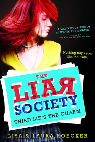
To Dye For
Even fake redheads are getting in on the redhead craze! (thanks to Twitter followers Emma and Susan and the lovely Sarra Manning for helping me out!)


Only those few today, because my computer is (surprise!) malfunctioning and my eyes are starting to cross from staring at so many covers. As always, have you noticed any cover trends lately? What about other types of trends? See if you can guess what the next trends I'm highlighting will be! I'll give you a cookie if you do.*
*No, I won't. But I'll eat a cookie in your honor.


Okay, I love the dystopian covers. The person from a distance trend is actually pretty cool and most of the ones you have listed are favorite covers.
ReplyDeleteI'm okay with silhouette covers but I am NOT a fan of kidding covers. I'm not a lovey dovey kinda girl, so perhaps that is why.
Redheads on covers are huge this year and I am ALL for that trend since I have red hair. Great post!
I really love the current trend for dystopian covers as well. They're totally dramatic and scream "THIS SOCIETY SUCKS BUT YOU SO WANT TO READ ABOUT IT." And I do.
DeleteI actually love a lot of the silhouette covers but like you AM NOT a kissy face cover person because I am old and crotchety and want to shout at them to leave space for a toaster between them like they used to do at my old summer camp at the dances because my camp was weird.
SO JEALOUS OF YOUR HAIR. I wish I was a redhead!
This is a very cool post! I read something similar recently about movie posters. As far as these covers go, I actually like the silhouette covers! I like that there are people on the covers, but readers aren't given a face. This way they can create these characters in their head. Looking forward to the next cover trend post! - Danielle D.
ReplyDeleteAw, thanks! And I think I saw that article, on of my followers pointed it out to me after I started doing these. I also love the silhouette covers. :)
DeleteMy favorites are the dystopian covers...so creepy and foreboding. Makes me want to read them all! I'm not big on kissy face covers either because I also am old and crotchety ;-)
ReplyDelete*high fives the fellow crotchety one*
Deletehahaha I love seeing these all together. It makes the similarities all the more obvious. The dystopian trend is SEVERE and even though I really do love the covers it is getting to be a bit overdone. I hate the kissing covers trend because, come on, isn't that intended solely from historical romances? At least I think that's where it should stay. I much prefer the pretty dress covers (although that was getting to be overdone as well.) Love this post!
ReplyDeleteBonnie @ Sweet Tidbits
Once you start putting them all together like that, the similarities jump out at you like CRAZY. My eyes, like, started to cross. Not a kissy cover fan, either, and while I love dystopias, this has made me see just how MANY similar-types are out there. And while it's nice to let the pretty dress trend lie somewhat fallow for a year, I also really do like them. They're just so pretty.
DeleteHa! Yes, so true. The "desert world" cover trend always strikes me as dramatic. And makes me want to drink water.
ReplyDeleteThere's also the "monochromatic" trend, like Nightmare Affair, where the cover is all shades of one color. Sort of a surreal overlay of an artistic world.
Oh goodness, and masks. And forests. And wind. And and and....you've covered all those already, I think. Good eye!
MASKS IS COMING UP YOU HAVE TOTALLY EARNED A VIRTUAL COOKIE WELL DONE
DeleteI really like that cover for Icons! I really didn't pay attention to the hair trend until you pointed out. I quite like the silhouette trend.
ReplyDelete